
Rover partnered with an agency to shift our brand positioning and messaging. After that, a small group of 3 designers (1 product designer—me—and 2 marketing designers) were tasked with using the new positioning to refresh and update the visual aspects of the brand.
My role: Partner with 1 marketing designer to create and pitch the new color palette and typography. Once approved, I would create the plan and designs for its adoption into our digital product. My partner would be responsible for the Brand’s physical collateral and all the marketing channels touch points.
Current state


Pain points starting out: Heavy reliance on green to do everything. The brand green we rely on is not accessible. Limited secondary palette with few colors deepens this reliance on green. Overall look and feel is messy and lifeless. Hard to create moments of delight in the product.
Direction
Infuse the brand visual with the feelings invoked by our new brand principles:
• Knowledgeable
• Playful
• Reliable
• Compassionate
• InclusiveBreakaway from using green in our UI elements, given its accessibility problems.
Selected screens of Before & After

Some visuals of the messy process


Testing different display serifs, seeing which colors would contrast well with the green
Our proposal

Making it a reality

Proposed new styling for all of our form controls
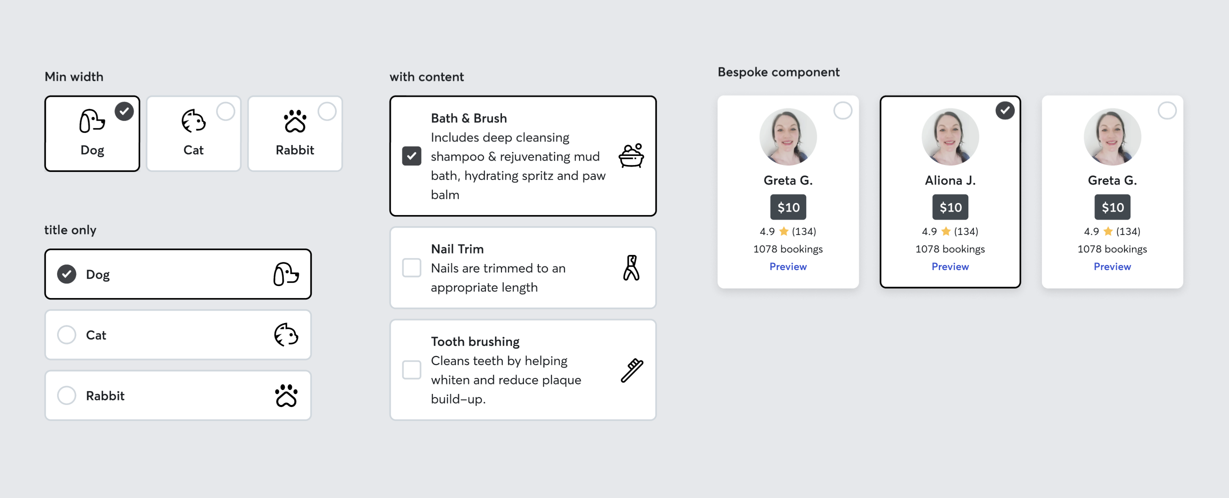
Component color & styling proposals

Applying new neutrals tokens, ensuring proper contrast. Previewing new controls & forms in a complex dialog to ensure it works

Example of old controls vs new
Redesigned certain screens to be shipped on our brand refresh launch date. Worked with the Eng team to update common components to the new brand

App splash screen and onboarding

Developed a Voiceover/Talkback spec template for the UX team as part of updating app screens. Previously no designer had ever spec’d for Voiceover
Wrote documentation for the new foundations

This project is in the process of rolling out, some changes have yet to launch but many have already. Our A/B testing of our button, link, and control colors show minor improvements which was not an explicit goal, but does indicate that reduced green overload and made our calls to action more clear. I expect to see further iteration by continuing to reducing content, create the right hierarchy, adding pops of color and doodles to create moments of playfulness and delight.