
Rover’s homepage was simultaneously empty and cluttered. The above the fold had many service buttons and dates and filters—all shown before even explaining what these services meant. It was reminiscent of airline homepages from 10 years ago.
Me and my design partner were tasked with envisioning the future of the page then work backwards to plan a multi-phased approach.

Before
Its not what you want
Process
We met with stakeholders and gathered existing data to gain insight into how the homepage was performing and where it could go in the future.
We mapped different user journeys through the homepage to identify if there were pain points that could be alleviated by better homepage messaging.
Through many rounds of testing we were able to create a list of sections that should be considered for inclusion. Sections could fall into 3 categories: building trust, how it works, and discovery.
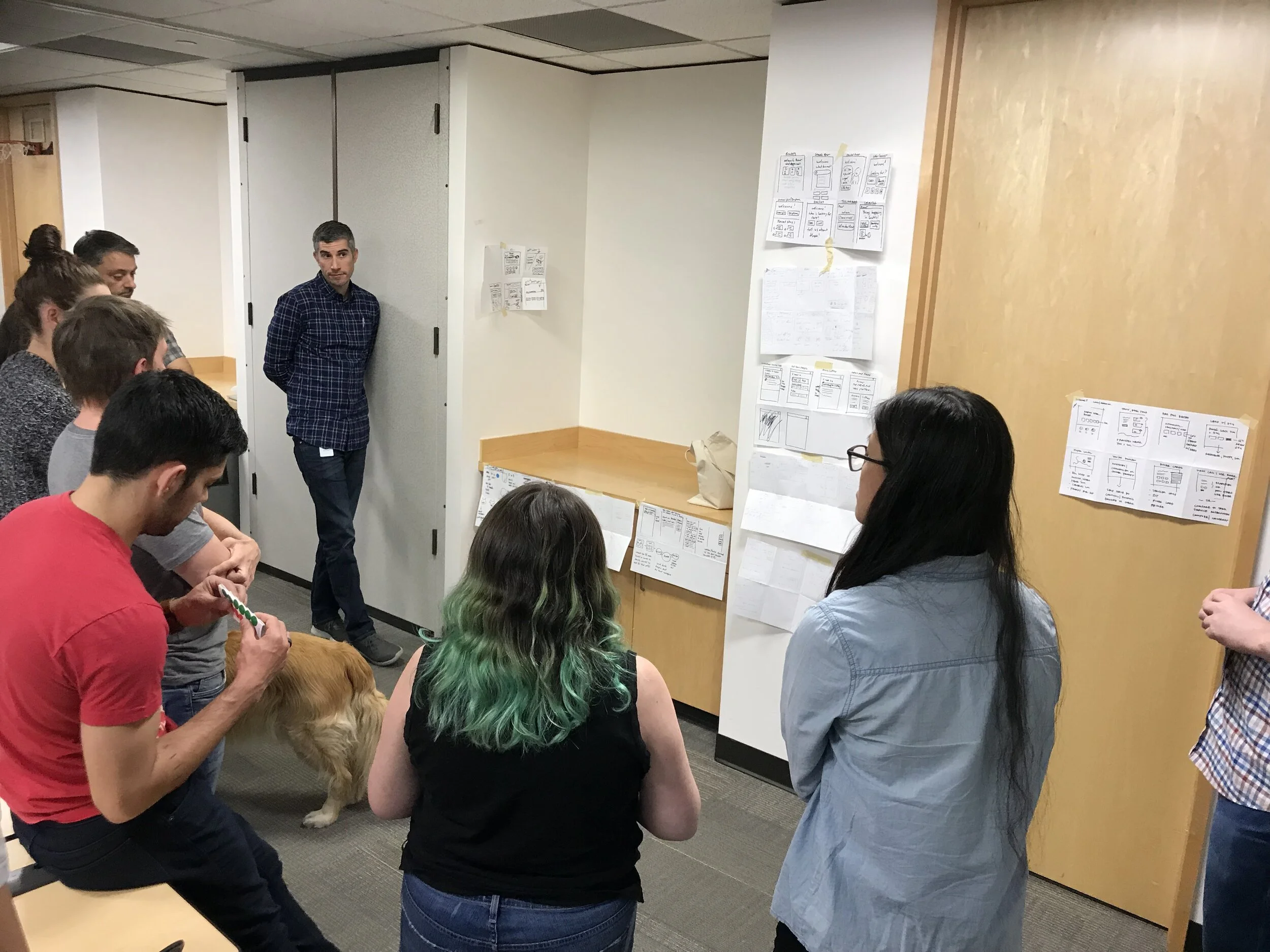
Brainstorming concepts workshop


Just a few concept sketches from team brainstorm
Usertesting
We conducted 2 rounds of usertesting studies with 7 tests in the first round and 2 in the second for a total of 9 usertests. The first round of tests were mobile focused to ensure that the concepts we generated would work on the app’s small form factor.

User scenarios and the journey from homepage -> booking funnel

Considering section sequence for mobile

Usertesting told us what sections worked and what was still missing
North Star
Our scope of work was limited to the web presence but we went further to show how incorporating editorial content and a design facelift would manifest the app.

Final Proposal

In addition to incorporating editorial content, we wanted to show how the “trust” elements would appear in the app. We identified that the on boarding point in time would be a key opportunity to introduce the trust elements. An app user might roughly know what the services is, but we want them to feel confident even before searching for the first time.
