
Launched in June 2022
Pain points
When the team grew from 3 to 10 designers in the span of 2 years, the growing pains were visible in the product. Each team member made new UI to fit their feature area with little consistency across teams. Time was wasted and the product looked messy.
None of the styles had semantic meanings making it very difficult for a designer to know what to use where or when.
The base UI components were a mix of an older version of Material design and bootstrap.
Most of our UI elements did not pass color contrast requirements.
Siloed teams meant very little consensus on newly created patterns and nothing was documented
“before” ~Feb 2022
Audit
Starting at the foundation layer I audited our product for color, typography, space, scale/proportion, and size. From the results of an initial survey I ran the team expressed a desire for simplicity.
How might we remove options that don’t add value, and in turn make it easier to assemble any given UI?
Foundations audit • Just a snippet of the opportunities
Team research
I met with 3 feature-team design leads to review the foundations audit of the product. There were lots of improvements and simplifications that could be made. In order to make the right decisions here I had to develop principles of what the ideal system should be. From my meetings with our designers the main areas of focus were:
Simplify - too many options right now
Modernize - our ui feels dated
Usability - make it easy for designers to use
Accessibility - We want to meet WCAG guidelines
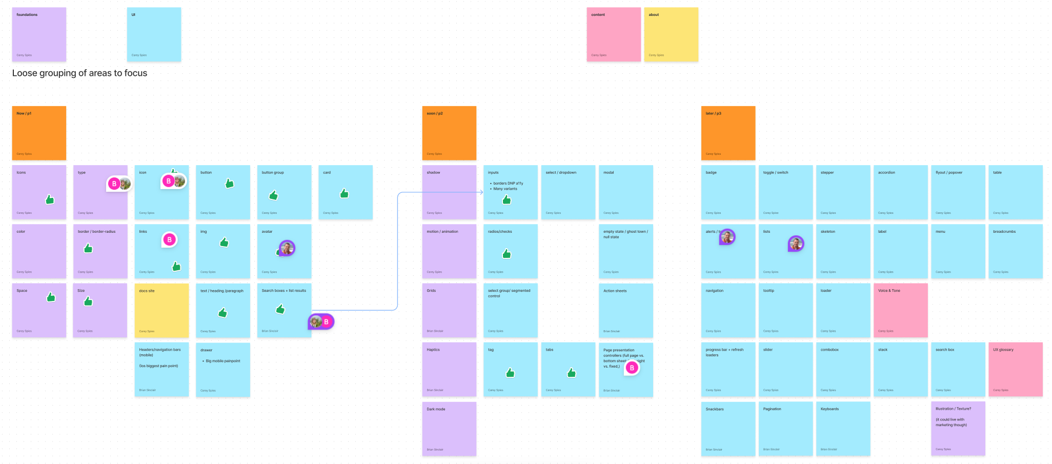
Simple roadmap
Based on what components were most used and what was most broken I put together a prioritization of what needed doing now, soon, and later.
Design Tokens
Since this was not a rebrand effort, I focused our color efforts around naming conventions. I introduced the concept of design tokens with semantic naming to the team. Simple Text, background, border, and a few status colors makeup the majority of our product. We introduced a typescale that was based on headings, text, and paragraph. Where we were hyper-specific before, this more general approach with a number scale was easy for designer to use during usability testing.

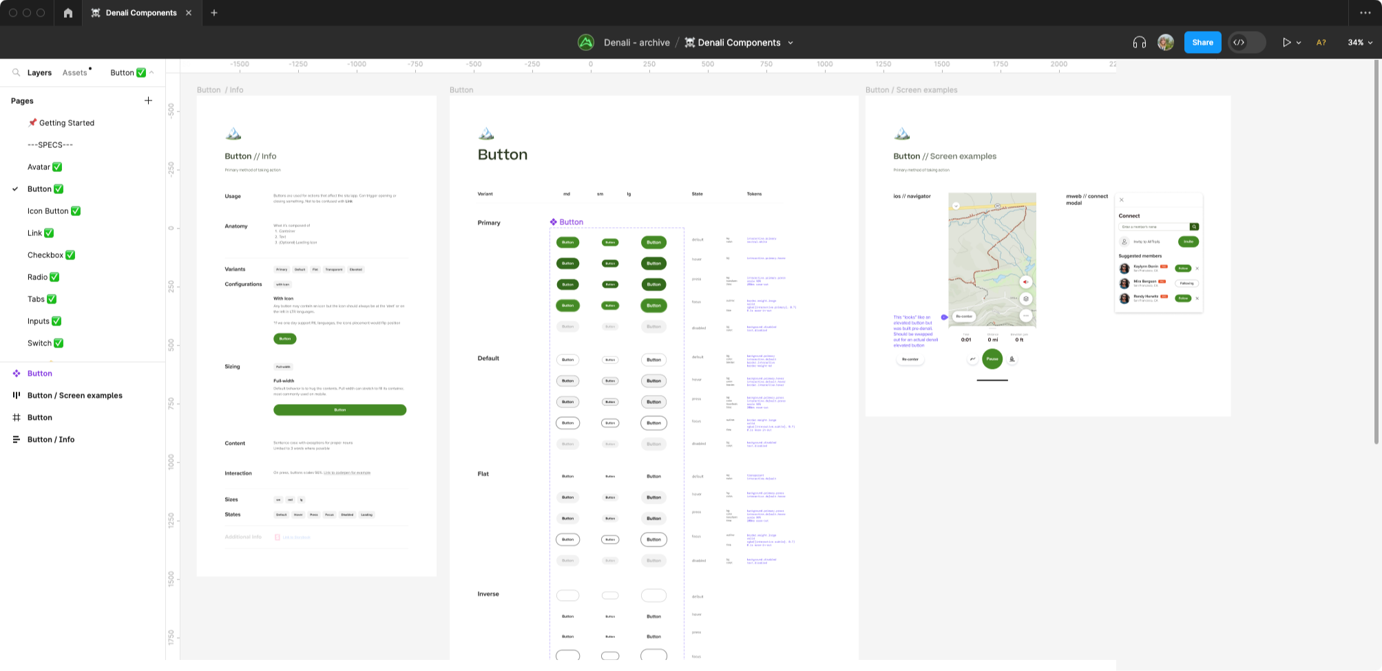
Component Library
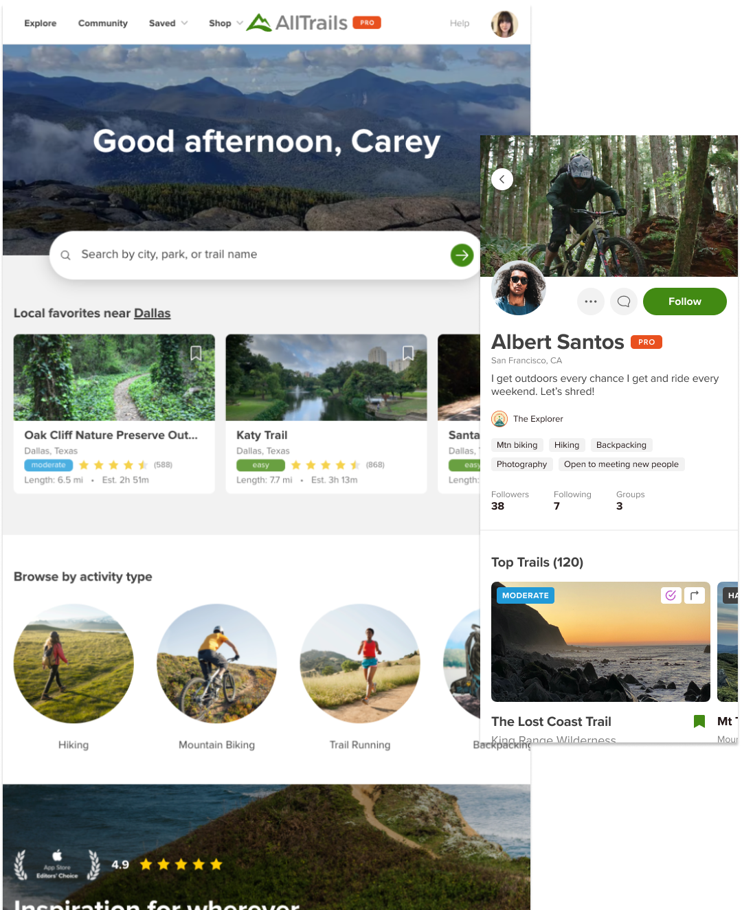
For each component I designed, I gave all the ways it could be used, and where you might find it in the product. Each state was mapped out and the relevant tokens were documented along with them. Figma, at the time (mid-2022) was limited in its token capabilities, so each style that was tokenized needed to be listed out. Showing examples where a given component shows up in the product was crucial to engineering adoption and was included by their request. Our Figma component library is the shared source of truth between design and engineering, it had to work well for both groups.
Naming the system
Every organization is different when it comes to naming design systems, and org buy-in is a critical component of the systems success. At AllTrails, we love a good name for our software projects, especially if it’s fun or outdoorsy.
I sourced names from our Design and Eng teams and filtered them down with voting. In order to encourage folks to talk about the design system it had to be easy to say and easy to write which was part of the selection process.
Denali was chosen, it being the name of a favorite national park of ours and for being the highest peak in North America, representing the kinds of heights we want to achieve. Hopefully we never have to ground-up a design system again in a way it also is The Last Frontier ;)
Choosing a name is as important as the design of the system itself.
Build
By the time our June Hackathon came around I had at least 20 components ready for dev. Only our web folks had initial interest in system components so a team of 3 front end developers and I spent the week cranking out our components and by the time the week was up we had a robust react component library.
